
Essential Energy
Brand Identity, Collateral Design
The challenge was to create a rebrand and corresponding assets for Essential Energy, an Orange County based solar company.
To address this challenge, the goal was to create a clean appearance using straight lines, a calming color palette, and sans serif typefaces.

The logo represents a solar panel using two interlocking "E's."

Pamphlets feature splash images, clean lines, and minimalistic typography.
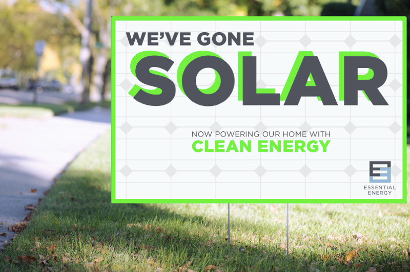
Yard signs promote solar installation to clients' neighbors.
Social Media
Social media posts and web banners promote a clean and healthy planet, and how Essential Energy is achieving their goals.